Customize Toolbars feature allows you to customize toolbars and bars by rearrange buttons positions, adding or remove buttons.
On toolbar may include one or more bars. Not all of the toolbars can be customized.
To have the changes made to toolbar saved and reloaded again at the software startup the Remember Layout option must be enabled.
To customize a toolbar open the Add or Remove Buttons menu. This menu can be invoked by clicking the drop down button located at the end of a bar.
The following tutorial is based on Media Player toolbar.

This menu contains the names of all bars in the customized toolbar. You can use these menu items to show and hide corresponding bars
Moreover, this menu contains a Customize... button. When you click this button then Customization window opens.
To show or hide buttons open a submenu with bar name, in our sample the Playlist Database submenu. This sub menu lists all buttons with the check marks.
Checking or uncheck in a check mark will make the button visible or not.
Furthermore, this menu enables you to reset the bar to the state as it was applied when designing the application. Click the Reset Toolbar item for this purpose.
Customization window
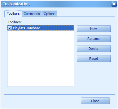
The Customization window is the control center for customizing bars at runtime
The image below shows the appearance of the Toolbars page.

You can use the check boxes displayed in front of bar names to control the visibility of the associated bars. The functionality of the buttons located in this page is described in the list below:
New
Creates a new empty bar. A dialog window prompting for the name of the newly created bar is invoked. You can drag links to the new bar from the Commands page of the customization window or from other bars. The following drag & drop operations can be performed on links:
| • | Dragging a button between bars, popup menus and sub-menus |
| • | Dragging a button away from bars, popup menus and sub-menus. This results in deleting the button. |
| • | Dragging a button from the Customization window to a bar, a popup menu or a sub-menu |
Rename
Invokes a dialog to rename the selected bar.
Delete
Deletes the selected bar. This button is only enabled for bars whose option is enabled.
Reset
Resets the selected bar. A confirmation dialog box is displayed before the bar is reset. If confirmed, the bar gets the appearance it had when you designed the Sprintbit Software.
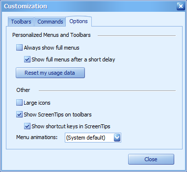
The image below shows the appearance of the Options page.

Always show full menus
If checked, disables the most recently used items mechanism. Otherwise, menus initially display only the most recently used items.
Show full menus after a short delay
If checked, all menu items are displayed after a short delay. Otherwise, only the most recently used items are displayed until the mouse pointer is over the expanding arrow. This setting has no effect when the Always show full menus check box is checked.
Reset my usage data Resets the selection preferences of menu items. After clicking this button, buttons that were marked as recently used at design time are displayed within menus, other buttons are hidden.
Large icons
If checked, bar items' icons are drawn twice as large.
Show Screen Tips on toolbars
If checked, hints are displayed for buttons.
Show shortcut keys in Screen Tips
If checked, shortcuts assigned to buttons are displayed within hints. This setting has no effect if the
Show Screen Tips on toolbars check box is not checked.
Shortcut Keys
Keys |
Description |
ALT |
Switches keyboard focus to the first link of the main menu. If bars already have keyboard focus, it is removed. Note that you can also set keyboard focus to any of the links associated with the bar manager. . |
Left and Right Arrows |
Navigate left and right through bar links. If the currently selected link is in a sub-menu, pressing these keys result in navigating to the neighboring link within the owning bar and expanding its sub-menu (if it is present). In this case, the first link within the expanded sub-menu becomes focused. If a bar is oriented vertically, the left and right arrow keys navigate up and down through links respectively. |
Up and Down Arrows |
Navigate up and down through links of a sub-menu or a popup menu. The down arrow key expands sub-menus when their owning links are focused. |
ESC |
Closes the currently expanded sub-menu or popup menu. If a sub-menu is closed, its owning link obtains keyboard focus. |
TAB |
Navigates right through links of a bar. If a bar is oriented vertically, navigates down through its links. |
SHIFT+TAB |
Navigates left through links of a bar. If a bar is oriented vertically, navigates up through its links. |
CTRL+TAB |
Moves keyboard focus to another bar if present. |
ENTER |
Invokes the focused link's functionality. Equivalent to clicking a link. |